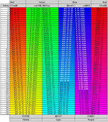
Did you notice? I have changed my blog. Not all of my blog, it will still be the same blog it was when it had a cream colored background. I just wanted to spiffy it up a bit, so it would look the best it could, but I am not always certain what looks best, so I got out a colorwheel.  First, I tried using this one. It turned out to be pretty complicated, so I got out another.

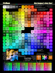 And I am not sure what Pearl, Hot, and Ultra are supposed to do for me either.
 I finally gave up on color wheel charts, after I found this one, and I couldn't use it. This one is the Aggie Color Wheel Chart, and it should be easy. Is it me, or is it the color wheels?
 So, after all this, I just went to clicking on buttons, changing this and that color, until I came up with what you see. I may leave it awhile, but don't be surprised if you come back and it has a cream colored background again.
First, I tried using this one. It turned out to be pretty complicated, so I got out another.
And again, and again.

Each colorwheel offered a n new set of choices, and each got more complicated than the last.
How would I use this?
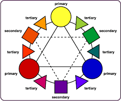 These would seem to be pretty straightforward, but they are really more complicated than I can handle. Simple!
 I need simple!
Each colorwheel offered a n new set of choices, and each got more complicated than the last.
How would I use this?
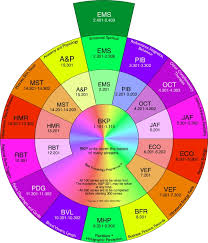
These would seem to be pretty straightforward, but they are really more complicated than I can handle. Simple!Not this, although it is very pretty...
And not this one, WHAT does that one mean, anyway?
And I am not sure what Pearl, Hot, and Ultra are supposed to do for me either.I finally gave up on color wheel charts, after I found this one, and I couldn't use it. This one is the Aggie Color Wheel Chart, and it should be easy. Is it me, or is it the color wheels?So, after all this, I just went to clicking on buttons, changing this and that color, until I came up with what you see. I may leave it awhile, but don't be surprised if you come back and it has a cream colored background again.

17 comments:
I LOVE these different diagrams you showed. I don't mind when people spiff up and change their blogs. It's like free decorating. The colors you picked look nice, and you are brilliant to consult a color wheel.
It looks great. The color wheels most neat. I've never figured out how to use them either.
I'm okay with using blue/orange, yellow/purple and red/green. It's trying to use those adjacent bunches, monochrome colors and triad set ups that make MY head bizzy, and light/dark hues and tints.
I made my background dark, dark for Halloween and then it seemed to be a trend.
fun post! I love all those color wheels! Though sometimes I'm confused because some people say you should use contrasting colors, some say they need to be next to each other. I think a lot of it tends to be in the eye of the beholder!
Now, I am dizzy, Janie! I love the main color of your blog, it's one of my favorites!
Just a comment.........for my aged eyes, the dark background seems to cause the print to blur....not my favorite state of viewing.
I must be in the minority here.
Still reading the black ones, but not enjoying it quite as much.
Wow - all those colours wheels made me dizzy too. Have to say, I'd vote for cream - I have no colour sense at all (sad for a gardener) and tend to play safe. I only revamped my own blog recently because my son took me firmly in hand and told me what to do ... But with these colours, you certainly stand out.... :)
I am still in a state of un-decided-ness here. I can't seem to make up my mind.
Funny post :) I like the new look. I have changed mine so many times. It's kind of like the feeling I get when I change my furniture.
I'm over Halloween and have lost the Navy Blue. Glenda's comment did it for me.
The little rectangles with numbers on them are HTML codes. I only resort to that one when there's a color I need that isn't on the little chart where you change colors on your blog. I've only needed that twice in 5 years, so it isn't a really big deal.
Wish I could renovate my house as quickly!
Janie,
Over on the Garden Bloggers blog, I have a post one some of the color generators I've come across for blogs.
http://www.gardenbloggers.com/2009/03/choosing-colors-for-your-garden-blog.html
Maybe you'll find it useful.
gld, no, I know what you mean about the dark backgrounds; in fact I posted about it on my blog. It makes my eyes go buggy and gives me a headache. I usually skip black background blogs. Here's a tip for reading them though: select all. It highlights the text giving it a light background with a dark text. Much easier to read - not so good for looking at pictures though.
Janie, I love your color choices and the color wheels you have found are making me drool. Must go check them out...
Yep. it makes me dizzy too.
I guess the simpler one or two colours makes a difference.
Many colours in the garden is one thing, too many in a computer screen is too much too handle.
I think the new color is terrific. I love this shade of green. I am a visual artist and I have never bothered with these blasted color wheels. My eye does a much better job of it and doesn't confuse the he** out of me in the process.
Hi Janie, you crack me up!!! All those color wheels make me dizzy as well. Even though my blog theme is black, well dark grey actually, I wanted to change the font colors and studied the charts and played around with it for weeks on end. Fun, but way too time consuming. I was changing the fonts and header picture for each post. Sometimes there are too many choices! I like your green, it is soothing, but I like change too and will look forward to see what you come up with. :-)
Frances
I use this site all the time:
www.colorschemer.com
Post a Comment